Phuse have recently designed and developed a brand new website for the Stacey's Auction house. The site features auction lots in current and recent auction catalogues which are available for customers to browse and submit commission bids. The addition of an online payment system gives customers the ability to pay for auction purchases online.
Our web team worked closely with Stacey's to produce an interactive site with a flexible administration system that allows staff to work efficiently and quickly when creating new auctions and managing individual lots.
The result is a professional looking site that gives Stacey's a powerful web presence and enhanced exposure for their auctions.
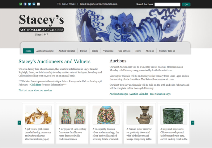
Stacey's Auctions - Home page
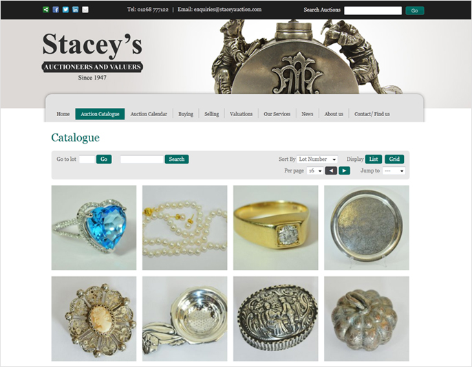
Stacey's Auctions - Auction catalogue page
You can view the completed site here: www.staceyauction.com
Phuse have recently produced a 40th anniversary video/animation for Sealine on behalf of Chapter Agency, The animation is a mixture of static images and video excerpts set in time to the music.
Two version of the video were created; a HTML5 version for iPad and iPhone users and a Flash version for standard PC and Mac users. The animation and video was built and edited entirely in house by Phuse.
Phuse have been chosen to develop an e-commerce website and online brand for Lescott Stewart; a new fashion label founded by Joleon Lescott and Jordan Stewart.
An initial preview only version of the site has just been launched with a full buy online version coming soon. You can see below some screengrabs of the new site developed by Phuse.
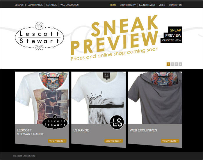
For the main products page shown below we have developed a scrolling carousel. We've added some extra functionality so iPad and otgher mobile visitors can scroll on finger touch.
You can view our web design portfolio for more examples of our work.
Listen To This is a series of four connected talks that bring together musicians, writers and critics. Developed and presented by author Daryl Easlea and academic Andrew Branch and hosted by Metal Culture.
To publicise the event Phuse were asked to develop an identity and brand concept to be used across a number of different mediums. The final design can be seen below plus a number of alternatives that were also presented.
This design concept was inspired by the album cover artwork of 'The Best of Blur' created by artist Julian Opie. Blur are one of the bands being covered in the series of talks so the connection here was relevant to the project. Instead of the four members of Blur we have four artists also discussed in the talks; Wilko Johnson, David Bowie, Pete Townshend and Jackie Wilson. The flyer is design to resemble an old vinyl single with the record half removed from the cover, the Listen To This logo is shown in the middle of the record. This was the design chosen by the client and has been produced initially as a die cut A5 flyer.
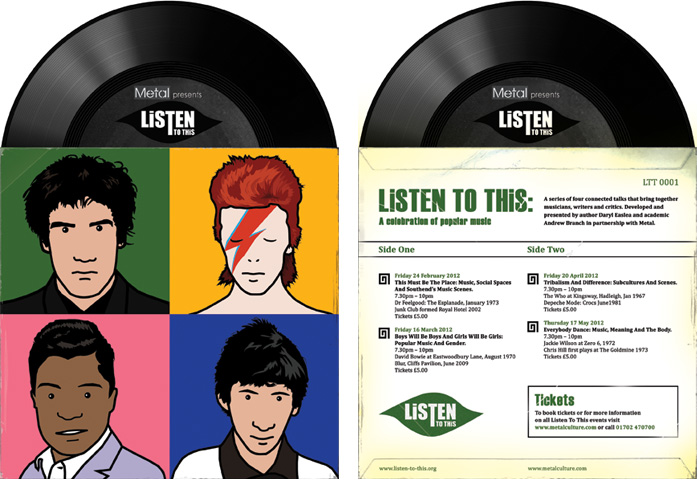
A number of different logos were also created as part of the design process, the chosen logo can be seen below right. This logo was conceived to resemble a 1960's record label logo.
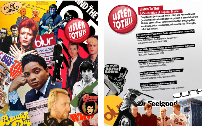
This design was inspired the small band badges that have been popular for decades. The front cover below left has a different badge for each artist or band discussed in the talks. The Listen To This logo is also in the style of a badge.
This design plays with the typography of a number of famous album and single covers to produce an effective flyer. The typefaces have been carried through to the back cover create a logo.
Reminiscent of scrapbook collages created in our teenage years this design brings together images of all the artists featured in the talks.
You can view our web design portfolio for more examples of our work.
Phuse have just been awarded the contract to develop a website for the enigmatic Lord Bath of Longleat. The pitching process involved the presentation of a number of home page design concepts for the website which can be seen below.
The new website which is currently under development will replace the current site www.lordbath.com (it's quite fun getting lost in this site!) and will feature galleries of Lord Bath's artwork, excerpts of his songs and poetry and his autobiography 'Strictly Private'.
We will also be going on location at Longleat in the next few weeks to do some 360 degree photography of the murals in Lord Bath's private apartments.
This design concept was the one chosen by the client. For the home page it uses a striking photomontage of Lord Bath in front of Longleat, the style and colour of the photo gives the design a ethereal feel which we think perfectly represents Lord Bath and his work.
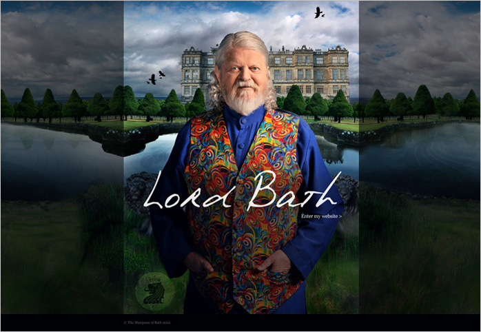
The interior or content pages of the site were designed to put the mural artwork of Lord Bath centre stage, giving the visual impression that you were standing in front of them. The actual design aspects of the page have been toned down to give maximum impact to the full screen photos.
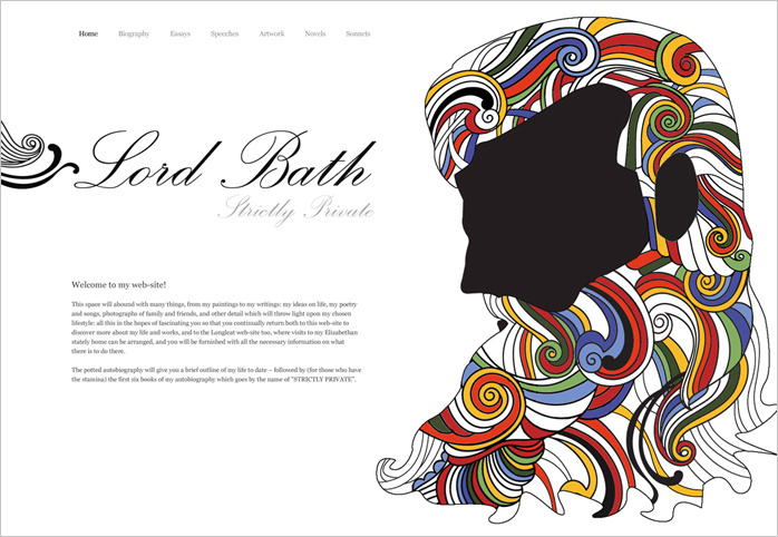
These two designs were favourites of ours. Lord Bath can be easily recognised by his beard, long hair and love of kaleidoscope coloured clothes. The idea behind this concept was to portray this simply and graphically using a head shot silhouette and psychedelic colours for the hair, reminiscent of psychedelic concert posters of the 1960's but with a clean modern feel.
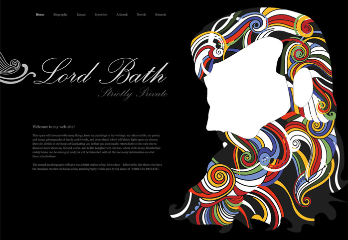
We presented two options of this concept one white and one black, we couldn't decide which one we liked best!
